Viewing active users for an app by team
Compare app usage across different teams
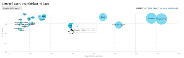
Visualize how different teams are using an application on the Engaged users/Unique logins chart on the Teams page for an application. The Engaged users chart shows for apps with an engagement connector, and the Unique logins chart shows for SSO apps. Identify positive trends as well as opportunities for improvement.
The chart plots each team as a bubble compared to lines representing the company average usage for this app, an adoption goal, and/or a benchmark. Teams with more users have larger bubbles. Teams above the company average line are successful app users with more team members using the app, while teams below the lines represent potential areas of concern for unused licenses or app training or support needs.
The dynamic chart displays detailed information for each team when hovering over it.
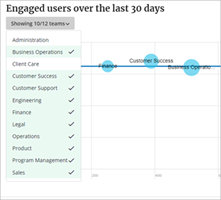
The ten biggest teams are shown by default. To change the team selection presented on the chart, select the Teams filter to select teams in your organization. Selected teams are highlighted.
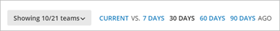
To identify efforts that have made an impact or identify unusual changes in activity, compare usage to past usage by selecting7 days, 30 days, 60 days or 90 days ago.
With a historical comparison selected, any change in usage for a team is color coded with a tail pointing up or down to show direction and amount of change in usage.
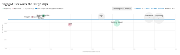
Hide or show those color-coded segments by clicking the label above the chart:
- Positive changes - more usage
- Negative changes - less usage
- No change - team usage stayed the same
- Organization-wide engagement - the overall company’s usage